 Assessment...
Below are some sample questions for you to judge your understanding of the material presented in Lesson 2. Record your answers and then check them by clicking on the "ANSWERS..." link at the bottom of this section.
-
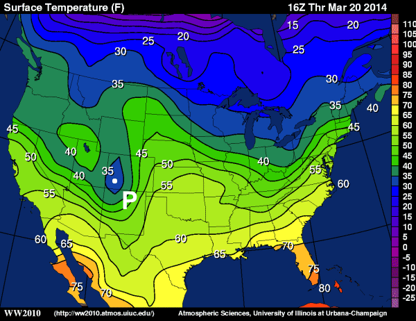
Consider the contour plot of temperatures below from 16Z on March 20, 2014.
Now answer the following questions:
- What is the range of temperatures observed in central Oklahoma?
- Give ranges for the warmest and coldest temperatures in the continental United States.
- Examine the point "P" located in western Colorado. What range in temperature values would you assign to point "P"?
- Identify a region where temperature is changing rapidly with distance. Explain how you identified this region.
- BONUS: Can you think of a reason why meteorologists might be interested in regions where temperatures change rapidly over a short distance?
-
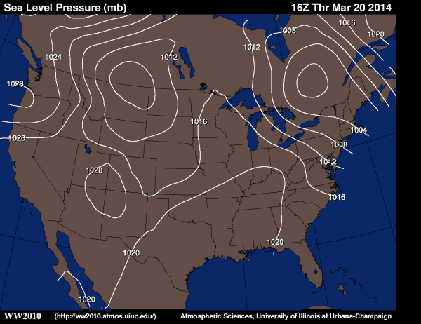
You are given an analysis of sea-level pressure below from 16Z on March 20, 2014.
Now answer the following questions:
- What is a valid range sea-level pressures observed in central Nebraska (don't forget proper units)?
- Give a range for the highest sea-level pressure in the continental United States.
- Identify (how many, and where) and label (give appropriate pressure ranges) all of the low pressure centers on this map.
- Identify a region where pressure is changing rapidly over a short distance. Explain how you identified this region.
- BONUS: Why might meteorologists want to know where pressure is changing rapidly over a short distance? What meteorological condition is associate with such pressure changes?
ANSWERS...
 Next Steps...
In this lesson you learned about how contour maps are created and interpreted. However, this sample skipped a few topics normally presented to our students in the Weather Forecasting Certificate program. To finish your instruction in weather data analysis you are going to need to learn about the concept of "gradients". Gradients are used to describe the horizontal change in a particular variable. Meteorologists often refer to the "temperature gradient" or the "pressure gradient" when discussion a particular weather pattern. It's definitely something that you should have in your weather toolbox.
The next concept that students typically learn at this stage is how to analyze weather data on maps having different projections. It can be quite tricky to figure out the wind direction from a station model plotted on a polar stereographic map. The key is to always know which way is north (it's not always up!) and how your sense of direction can be changed by various map projections. Finally, we would be remiss if we didn't talk about data collected over the ocean. Although this seems to be more appropriately discussed in Lesson 1, this lesson also examines the types and format of data collected by ships and buoys. This data can be of vital importance when constructing contour plots over the oceans (where observations can be rather sparse).
Now that we've discussed how observations are often displayed and analyzed by meteorologists, it's time to examine another valuable source of data... remotely sensed data. Unlike surface observations which directly sample the air, data such as satellite images are collect from afar. There are definitely some advantages and disadvantages that arise from using satellite data. The key is to know just exactly what you are looking at and not make poor assumptions when interpreting them.
On to Lesson 3!