 Prioritize...
After reading this section, you should be able to describe what is displayed on infrared satellite imagery. That is, what is the IR sensor on the satellite measuring and how do we interpret these measurements? You should also be able to explain the key assumption that we make about the atmosphere when interpreting IR satellite images and how this assumption allows us to determine cloud top heights. Finally, it is important that you be able to differentiate an IR image from visible, water vapor, and radar imagery. This skill involves knowing what clues distinguish one type of imagery from another. Read...
Why would we want to look at the atmosphere at wavelengths other than visible? There is that pesky problem that visible imagery is useless at night, but is this really the impetus for developing a host of other remote sensing instruments? I am reminded by the old story of a group of blind men who are trying to describe an elephant. Each person feels a different part of the elephant and thus describes it saying "an elephant is like a pillar (or wall, or rope, or snake, etc)". The moral of the story is that only by combining their individual observations can they develop a true picture of the elephant.
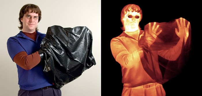
This analogy works well for remote sensing of the atmosphere because each measurement is only made at a single wavelength of the electromagnetic spectrum. By limiting our "vision" in such a way, we diminish our ability to describe the atmosphere accurately. Consider the image below. On the left, we see a visible image of a man holding a black plastic trash bag. On the right, is an infrared image of that same man. Notice that by switching to infrared radiation, we have gained more information (we can see his hands) than we had just using visible light. Furthermore, the fact that the shading in the infrared image is very different from the visible image suggests that there may be even more information to be gleaned from this new "look".
Before we delve into what can be learned from infrared satellite imagery, it is important to discuss what an infrared satellite image is actually displaying, what measurements that display is based on, and assumptions that we make to interpret such images. Let me start with a very simple (simulated) example. Just like visible images, infrared images are captured by a radiometer tuned to a specific wavelength. For standard IR satellite imagery this wavelength is 10.7 microns. The satellite radiometer therefore captures a grid of radiation intensity values at 10.7 microns. Next, these radiation values are converted into temperatures using equations derived from Planck's Law and Kirchhoff's Law. These satellite derived temperature values are formally called "brightness temperatures" because the values are derived from radiation intensity. Finally each of the grid cells is colored according to some temperature-color scale. With the addition of an overlaid map... Voila! A simulated infrared satellite image is born.
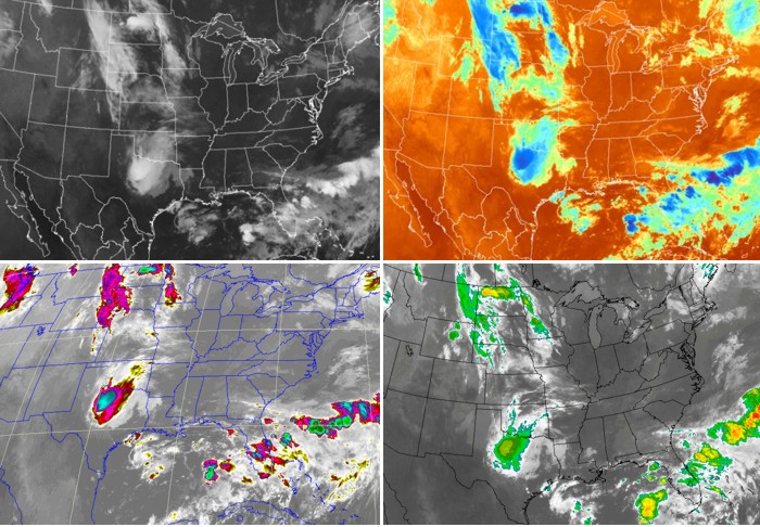
When you look at different visible satellite images, you will notice that they pretty much all look the same. Not so with infrared imagery (see the montage of images below). Some infrared images are colored to resemble visible images (upper-left), while others include all the colors of the rainbow! Such IR images that contain different color schemes are usually called enhanced infrared images... not because they are better, but because the color scheme highlights some particular feature of the image (such as very cold brightness temperatures). Is there any fundamental difference between enhanced IR images and "regular" IR images? The answer is no. I could have very well colored my simulated IR image in a more colorful fashion if I had wanted to. The way an image is colored does not change the data it is presenting. The key with any IR image is to locate the temperature-color scale (usually on the side or bottom of the image). Once you have located the scale, you are well on your way to interpreting IR images. Here are the uncropped images for the "traditional" IR image and lower-right "enhanced image". Locate the temperature scales on each image.
So what are IR satellite images really displaying? We have said that an IR radiometer measures the intensity of radiation and converts it into brightness temperatures. But what temperature are we measuring? To answer this question, refer to the atmospheric absorption chart. Notice that absorption by atmospheric gases (including water vapor) at this wavelength is small compared to absorption at other infrared wavelengths. This means that for a cloudless sky, we are simply seeing the temperature of the Earth's surface (because IR radiation at this wavelength passes right through a "clear" atmosphere). To demonstrate my point, check out this loop of infrared images of the Sahara Desert. Note the very dramatic changes in ground temperatures from night (light grey ground) to day (dark grey/black ground). This is because dramatic diurnal changes in ground temperatures often occur over the deserts, where the broiling sun bakes the earth's surface by day. At night, however, the desert floor often cools off rapidly after sunset. Want another example? Check out "Cold Frontal Passage" in the Case Studies section.
What about when clouds block the satellite's view of the surface... what temperature is being displayed? Remember that at a wavelength of 10.7 microns the atmospheric gases absorb very little (and thus emit very little by Kirchhoff's Law). However, this is not the case for liquid water and ice, which emit like gangbusters at this wavelength. Therefore, any clouds that are in the view of the satellite will be emitting radiation consistent with their temperatures. What about the surface radiation? Doesn't the surface radiation contribute to the radiation emitted by the clouds? The answer is "no". The surface radiation is completely absorbed by the clouds above it. Remember that since the clouds emit IR radiation well at this wavelength, they also absorb radiation well. So even though there is plenty of IR radiation coming from below the cloud and even from within the cloud itself, the only radiation that reaches the satellite is from the cloud top. Therefore, IR imagery is the display of either cloud-top temperatures or the Earth's surface temperature (if no clouds are present).
So now that we know the temperature of the cloud tops, what use is this information? Well, if we make the simple assumption that temperature decreases with height in the lower atmosphere (that is, the troposphere), then we can equate cloud-top temperature to cloud-top heights. In other words, clouds with cold cloud-top temperatures are high-altitude cloud tops (for example: cirrostratus, cirrocumulus, cumulonimbus). Clouds (such as stratus, stratocumulus, or cumulus) with warmer cloud-top temperatures have tops that reside at a low altitude.
In order to identify the specific types of clouds from space, weather forecasters use visible and infrared imagery in tandem with each other. Visible imagery distinguishes between thick and thin clouds while infrared imagery distinguishes between high and low clouds. When you put them together, the unbeatable combination helps to specifically identify types of clouds.
Let's apply this quick summary to a real case so I can drive home my point that visible and infrared satellite imagery work as a team to help you identify cloud types. Please examine the side-by-side visible and infrared images below. Note the line of bright white clouds extending from the Outer Banks of North Carolina to central Florida (marked by point "A"). Their brightness on visible imagery indicates that they are thick clouds. Shifting your eye to the same area on the infrared image, note the bright-white appearance, indicating cold cloud tops. Thus, given that these clouds are thick and have cold tops, it's pretty safe to assume that they likely belong to the family of cumulonimbus (whose tops can reach altitudes as high as 60,000 feet).
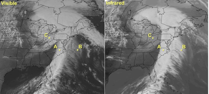
Now focus your attention on the feathery clouds over the Atlantic just to the east of the line of cumulonimbi (point "B"). Obviously, these feathery clouds are not as bright as the cumulonimbi on visible imagery (and, thus, not as thick...not even close). Indeed, these clouds are relatively thin. On the infrared image, these thin clouds appear white, meaning that they have cold tops. As a result, we can now categorize these clouds as cirrus. One caveat is in order about clouds with thin spots. In this case, infrared radiation from the earth's surface "leaks" through thin spots and holes in clouds and reaches the satellite. With a mix of less-intense radiation from the tops of high clouds and more-intense radiation leaking through from the ground, the satellite senses an average signal that's somewhere in between, resulting in cloud tops seeming warmer and lower than they really are
Finally, lets turn our attention to the clouds over the Great Lakes and the upper Ohio Valley (Point "C"). On the infrared image, their grayish appearance gives them away as low clouds. On the visible image, these clouds are fairly bright, meaning that they are modestly thick clouds. Given the cellular nature of the clouds in some areas as well as the apparent breaks between blobs of clouds, we deduce that these are likely stratocumulus, with maybe a solid deck of stratus over parts of the upper Great Lakes.
The lesson learned here is that both visible and infrared imagery can be used together to identify cloud types during the daytime. At night, routine visible imagery is not feasible, so weather forecasters must rely almost exclusively on infrared imagery. Though infrared imagery is indispensable at night, it has some drawbacks. Detecting nighttime low clouds and fog can be tantamount to impossible because the radiating temperatures of the tops of low clouds and fog are often nearly the same as nearby ground where stratus clouds haven't formed.
To learn more about the shortcomings of IR images at night and to review what you've already learned in this section, We're going to use an infrared imagery simulator. This simulator allows us to look at how hypothetical situations might be depicted on infrared imagery. So, if you haven't already, open the simulator and keep it open for this discussion. Just so that you have your bearings, please note that the controls for cloud thickness, cloud-top height and surface temperature are on the right cross section of the atmosphere. After you set the controls in the right window, the left window will show you the corresponding infrared image that results from your settings in the right window. Please keep in mind that the window on your left displays a simulation of what the real infrared image would look like.
To begin, set the surface temperature slider to around -7 degrees C (~10 degrees F). Now, click and drag the cloud as low as it will go. What do you notice about the simulated satellite image? You should see that there is very little observed difference between the cloudy region and clear-sky region. The reason of course is that low clouds are very often within a few degrees of the surface temperature and thus are not distinguishable from cloud-free regions. To make matters worse, this small temperature disparity is most often observed during the night (precisely when visible satellite imagery is useless as well). There are methods for detecting low clouds in such instances and they involve differencing two different IR wavelengths to extract only the low cloud field (you can read this article about fog and low cloud detection, if you are interested).
Another observation that you might make at night or in the early morning is that the ground in cloud-free areas is actually colder than cloud tops of nearby low clouds. We'll learn the reasoning behind this in the next lesson, but it can cause IR images to look a bit strange. Return to the IR simulator and slide the temperature slider to -15C. Now what do you observe? The cloud-free region is lighter than the cloudy region. If you weren't careful (and they weren't labeled) you might mix up the two regions. Take a look at the image below, collected at 1131Z on February 25, 2008. Focus your attention on the slightly darker patch over south central Texas (between stations K3R5 and KNIR). Is this region covered by clouds, or is it clear?
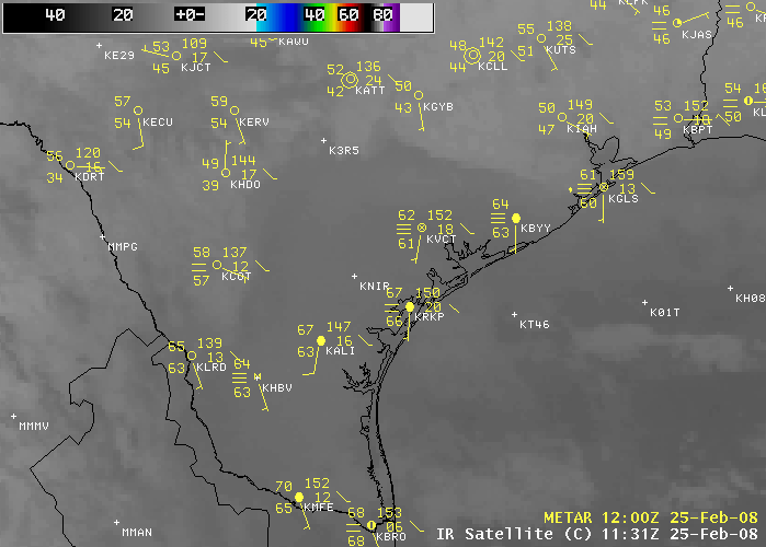
You might be tempted to make assumption that the darker patch is warmer and thus must be the bare ground. But, check out the station model observations. The stations in the dark region show overcast skies or sky obscured by fog. In fact, the colder areas are the clear sky and the warmer region is covered by low clouds and fog. In the case above, there are several indicators that the ground might be colder than the low cloud tops. First of all, during the cold season, nighttime temperatures near the ground are often colder than overlying air (note the date on the satellite image). Secondly, the time of the image is 1131Z, right before sunrise. This is when the morning ground temperatures are their lowest. If the ground is going to be colder than the tops of low clouds, this is the time of day when this will occur. The bottom line here is that you have to be careful when dealing with low clouds at night on an IR image. Just remember that you are looking at temperatures and that lighter grey doesn't necessarily mean cloudy skies.
This concludes our discussion of infrared satellite imagery. Now it's time to tackle water vapor imagery. But first, review the following key points of what we have discussed in this section.
- is based on the fact that measuring an object's IR emission tells you something about its temperature.
- displays the temperature of either cloud tops or the earth's surface (if the sky is clear).
- can be combined with the assumption that temperature decreases with height to allow cloud-top heights to be determined. Colder cloud-top temperatures mean higher clouds.
- is not able to give any direct indication of cloud thickness or the presence of precipitation (although inferences can be made in some cases).
- should not be confused with radar images. Apprentice forecasters often confuse enhanced infrared satellite images with similarly colored radar images. If you are uncertain, look at the color key (an infrared image will always have units of temperature).
 Case Study...
Cold Frontal Passage
At 06Z on January 17, 2012, a strong cold front was knifing southward into northern Oklahoma and northern Texas. To see what I mean, compare the temperatures north of the cold front with temperatures south of the front on this 06Z surface analysis (readings were in the single digits and teens compared to temperatures in the upper 40s, 50s and 60s...also see the 06Z analysis of isotherms). Granted, 06Z was local midnight in this part of the country, but I'm planning to show you a loop of infrared satellite images that will span into the daytime hours the next morning (the loop ends at 1640Z, which corresponds to 10:40 A.M. local time). Before you look at the loop, check out one of the images near the start of the loop...around 06Z (0615Z infrared satellite image). So you can get your bearings, I indicated the leading edge of the colder air (the yellow arrows point to a lighter gray that indicates the underlying cold ground behind the cold front). Okay, now follow the southward progression of the cold air on the loop of infrared satellite images. Again, we're essentially looking at the ground that became colder as chilly air arrived in the wake of the cold front. Just to prove to you that there weren't many clouds associated with the passage of this cold front, check out the meteogram at Dallas, Texas.Crash of TAM Flight 3054
Around 2150Z (6:50 P.M. local time) on July 17, 2007, a TAM Airlines Airbus A320 crashed trying to land at Sao Paulo, Brazil. Approximately 200 people lost their lives. The media initially reported that the plane crashed in a "driving rainstorm". Yet, when I look at the timely enhanced infrared image (2158Z), I wonder what they were talking about. Indeed, cloud-top temperatures over Sao Paulo (SBSP is the airport's station identifier) ranged approximately between -30 and -40 degrees Celsius. Thunderstorms producing heavy rain (cloud-top temperatures between -60 and -70 degrees Celsius, represented by various shades of deep red) were, at this time, still relatively far to the west of Sao Paulo.
At most, moderate rain was falling at Sao Paulo fell at the time of the crash. More than likely, however, the rain was probably light (lower, warmer cloud tops typically correlate to nimbostratus clouds which typically have lower rainfall rates). The meteogram for Sao Paulo confirms the screaming message we glean from the infrared satellite image... the rain was light.
I'm not saying that rain didn't play any contributing role in the crash. Indeed, Sao Paulo's airport runway was re-surfaced the previous month and grooves had not yet been etched in the runway to promote run-off from rain (the grooves help to prevent hydroplaning). According to the final investigative report however, the main cause of the crash was pilot error (read more about the crash of TAM Flight 3054).
 Explore Further...
With all this talk about infrared satellite images, I thought that I would list some website where you can get various flavors of infrared imagery. Enjoy.
Penn State e-wall: PSU General site; Enhanced IR US (CONUS); 24-frame Loop Enhanced IR US (CONUS); N.H. Composite
UCAR Realtime Weather: UCAR General site (you can select various types of satellite imagery from this page).
SSEC University of Wisconsin: SSEC General site; Satellite Browser (lots of stuff to look at, particularly different parts of the globe)
University of Washington: UW General site; GOES-EAST Enhanced IR (full disk, high resolution); GOES-WEST Enhanced IR