 Prioritize...
At the completion of this section, you should be able to describe what visible satellite imagery is displaying. That is, what is the visible sensor on the satellite measuring and how do we interpret these measurements? You should also be able to describe when it is appropriate to use visible satellite imagery and when it is not. After completing the sections on infrared imagery, water vapor imagery, and radar imagery, you should also be able distinguish visible satellite imagery from these other types. Read...
Click back to the absorptivity graphic that I introduced earlier. Notice that, from a little less than 0.4 microns to about 0.7 microns, there's a lot of white showing on the plot of the atmosphere's absorptivity, meaning that the absorption of visible light by the atmosphere, taken as a whole, is relatively small. In other words, the atmosphere transmits most of the sun's visible light from its top toward the Earth's surface. Along the way, of course, clouds can reflect (scatter) some of the visible light back toward space. Moreover, in cloudless regions, where transmitted sunlight reaches the Earth's surface, land, oceans, deserts, glaciers, etc. unequally reflect some of the surface-impinging visible light back toward space (with limited absorption along the way). You might say that visible light generally gets a free pass while it travels through the atmosphere.
An instrument on the satellite, called an imaging radiometer, measures the intensity (brightness) of the visible light scattered back to the satellite. I should note that, unlike our eyes, or even a standard camera, this radiometer is tuned to only measure very small wavelength intervals (called "bands"). In the case of visible satellite images the visible "band" is centered at 0.65 microns. The shading of clouds, the Earth's surface (in cloudless areas) and other features, such as smoke from a large forest fire or the plume of an erupting volcano, all can be see on a visible satellite image because of the sunlight light they reflect.
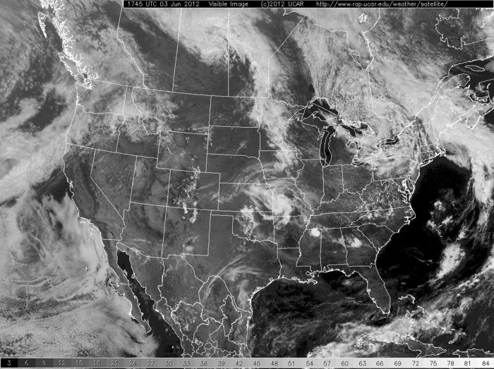
What determines the brightness of the visible light reflected back to the satellite and thus the shading of objects on a visible satellite image? First and foremost, you must have light to be scattered. What do I mean by this? Check out this sample satellite image of the United States? Why is the western U.S. so dark... are there just no clouds there? (Hint: Check the time... 1045Z) The point is (and this is often forgotten by new apprentice forecasters) that visible satellite imagery is only useful during the local daytime because we are measuring the amount of sunlight being scattered from clouds and the surface. No sunlight... no image.
Now, assuming that it is during the day, the brightness of the visible light reflected by an object back to the satellite largely depends on the object's albedo, which is simply the ratio of the amount of reflected light to the amount of light incident on the object. For example, check out this sample aerial photograph. Consider 100 units of visible light incident on an open patch of bare soil. The soil reflects back about 35 units of visible light, meaning that the albedo of the soil is 35 percent. Compare that with the albedo of vegetation, which tends to be around 15 percent. In the photograph, notice the difference in albedo between the fallow fields, the planted fields, the plots with trees, and the paved roads. To drive home my point, here's how a single-wavelength radiometer might see it. Now can you see how differences in albedo can create the various shades of brightness seen on a typical visible satellite image? By the way, oceans, with a representative albedo of only 8 percent, typically appear darkest on visible satellite images, as is the case on the image below.
As you learned in an earlier section, there are several different types of clouds and they too have different albedos. "Why?" might you ask. Aren't all clouds white when viewed from the top?
To explain why different clouds have varying albedos, let's perform an experiment. First, start with a tank of water (upper left in the photograph below). Now add a just table-spoon of milk (upper right). What happens from a radiation stand-point? Using language that we learned in The Roads Traveled Most by Radiation, certainly the transmission of radiation has been decreased by the milk (the word "SURFACE" has become a bit obscured). The most important observation however, is that the milk-water mixture now has an increased albedo. The water has taken on a whitish appearance because some of the radiation that is passing front-to-back through the tank is being scattered back towards the observer. In frame #3 (lower-left), another table-spoon of milk has been added. Now we see that the tiny globules of milk fat have decreased transmission dramatically (we can just barely see the "Surface" sign. Furthermore, albedo has been increased further. In the last frame (lower-right) yet another table-spoon of milk has been added. Now, there is nearly zero transmission (certainly not enough to observe), and the albedo is approaching it's maximum value for milk.
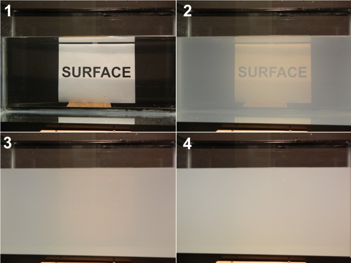
There are some interesting observations that you should hold onto when we transition from this simple experiment to the atmosphere. First of all, it doesn't take that many particles (1 table-spoon of milk in a 10-gallon fish tank) to begin to dramatically decrease transmission and increase albedo. Second, where scattering is concerned, a medium can very quickly become "optically thick" -- that is, nearly zero transmission and large amounts of scattering (we're ignoring absorption in this case). Finally, notice that we are a long way from a tank of pure milk in frame #4, but even switching to pure milk will buy us perhaps only a 20-30% increase in albedo. This is true of clouds as well once a cloud becomes "thick enough", additional growth will not change it's appearance appreciably.
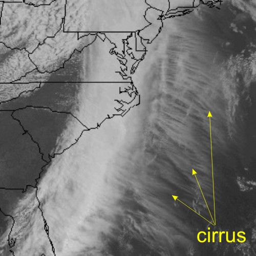
So how does this experiment relate to clouds on a visible satellite image? Some clouds, like thick cumulonimbus, are like tall glasses of milk in the sky. Granted, these clouds aren't made of milk droplets, but they contain lots of light-scattering water droplets and/or ice crystals. Meteorologists say that such clouds have a "high-water (or ice) content". It should then come as no surprise that thick clouds like cumulonimbus have albedos as high as 90 percent and appear bright white on visible satellite imagery. More subdued clouds, such as fog and stratus, typically have a lower water content, and, in the spirit of the glass of water with just a little milk, a lower albedo. Indeed, the albedo for thin (shallow) fog and stratus can be as low as 40 percent. So, as a general rule, fog and stratus often appear as a duller white appearance compared to thicker, brighter cumulus clouds. Here's an example of river valley fog over Pennsylvania and New York.Wispy, thin cirrus clouds have the lowest albedo (low ice content), averaging about 30 percent. They appear almost grayish compared to the bright white of thick cumulonimbus clouds outlined on the satellite image below.
As a general caveat to our discussion about determining shading on visible satellite images, I point out that, in addition to the albedo of the reflecting object, its brightness also depends on sun angle. For example, the brightness of the visible light reflected back to the satellite near sunset is limited, given the low sun angle and the relatively high position of the satellite.
To see what I mean, check out this close-up loop of visible satellite images on the afternoon and evening of July 1, 2011, when severe thunderstorms erupted over South Dakota, Minnesota and Iowa. Notice how clouds darken as sunset approaches. If you look closely at the images near the end of the loop, you'll be able to see tall cumulonimbus clouds cast shadows to the east. Pretty cool, eh?
But before we wrap up visible satellite imagery, I'd like to feed any "weather-weenie" feelings that might now be stirring within you. If you're starting to get interested in looking at the weather, I recommend the satellite images from Penn State University and the National Center for Atmospheric Research (NCAR). The NCAR Web site even includes a five-day archive.
Okay, before moving on to infrared satellite imagery, review the following key points.
- is based on the brightness of objects that scatter visible sunlight back to the satellite. This back-scattering property is called "albedo".
- can tell you something about the thickness of clouds, but only inferences can be made about their location (altitude) in the atmosphere.
- can be used to distinguish between snow cover and clouds, given that surface features such as lakes and rivers can be observed (see Case Study below).
- is not able to detect clouds (or anything else) during the satellite's local night (visible imagery requires sunlight).
- is not useful for determining whether precipitation is present under the observed clouds.
 Case Study...
Snow Cover or Clouds?
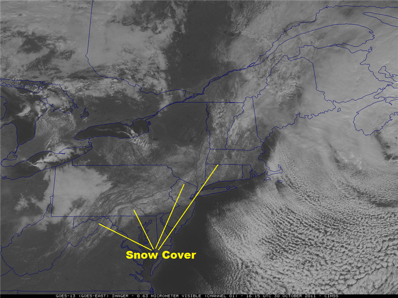
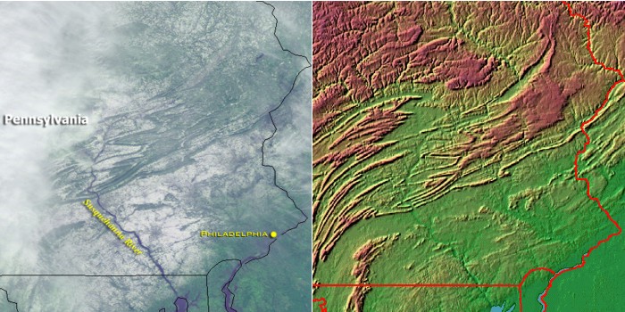
Cloudless, snow-covered regions, with albedos as high as 80 percent (freshly fallen snow), also appear bright on visible satellite imagery. Again, this bright appearance of snow cover on visible imagery is consistent with human perception. The visible image below, from GOES-13 at 1615Z on October 30, 2011, shows a stripe of snow cover left in the wake of the historic storm that dumped as much as 32 inches of snow over the Northeast. One of the reasons I know that we're looking at snow cover instead of clouds is that I can see the outline of the Susquehanna River in Pennsylvania (annotated image of October 30, 2011). The river was relatively warm, so snow didn't accumulate on the water (it would have had there been ice on the river). But snow accumulated on the surrounding valley floor, allowing the river to stand out and take on a long, dark and sinuous appearance from space.
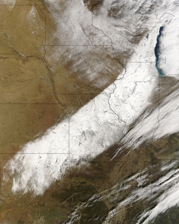
To drive home my point about how you can detect snow cover on a static visible satellite image, check out this striking visible image taken during the Winter of 2002 (from GOES-8). On January 31, a low-pressure system produced a relatively narrow swath of snow across the Middle West as it moved northeast from the central Plains to the Great Lakes region. Once the sky cleared in the wake of the storm, the darker veins marking the unfrozen rivers of the upper Middle West (Iowa, etc.) stood out against the backdrop of this stripe of snow cover.
Like unfrozen rivers against a backdrop of snow cover, deciduous and coniferous forests also appear "dark" on visible imagery. For example, check out this visible satellite image of snow-covered Pennsylvania and bordering states. Note the system of snow-covered mountain ridges and agricultural valleys through which the Susquehanna River runs (compare the satellite image with the topographical map). The dense deciduous and coniferous trees on the ridges mask the high albedo of the underlying snowpack, thereby presenting a much darker appearance to space than the snow-covered valleys. In other words, the highly reflective snowpack on the mountain ridges is masked by the lower albedo of the deciduous and coniferous forests (keep in mind that trees lose the snow that accumulates on their limbs fairly quickly as winds increase in the wake of a storm). Meanwhile, the relatively forest-free agricultural valleys appear white.
Other than for noting the dark veins of river systems and forests on static visible imagery, an alternative method for distinguishing between snow cover and clouds is to look closely at "satellite loops" (animations of visible imagery over a period of a few to several hours). Features that move as time goes on obviously represent clouds, while white areas that hold steady in time represent snow cover. This loop of visible images taken in the aftermath of the historic snowstorm on October 29, 2011, shows a few clouds moving west to east, but the snow cover doesn't even budge. If you look closely, you'll be able to see the eye-like swirl of clouds off the Northeast Coast marks the center of the culprit low-pressure system.
Not convinced? Check out this national loop of visible satellite images from GOES-12 on December 4, 2006 ... note the wide swath of snow cover over the Middle West (here's a single "true color" image of the snowpack from the Terra satellite).
The only "fly in the ointment" for using loops of visible satellite images to detect snow cover occurs when snowpacks melt rapidly. For example, early on December 12, 1998, in the aftermath of a fairly localized snowstorm, snow cover over western Texas was readily visible from GOES-8. During the rest of this relatively warm, sunny day, snow cover melted very rapidly , perhaps lending the mistaken impression that there were moving or dissipating clouds over the region.
A more recent example occurred on October 10, 2011, in the aftermath of an elevation-dependent snowstorm in southeast Wyoming two days earlier (read more about the October 10th storm). Check out the 1645Z visible satellite image from GOES-15 on October 10, which shows a portion of the leftover snow cover. Now watch the early October sun eat away at the snow cover during the day (here's the loop of visible satellite images on October 10, 2011).