 Prioritize...
Meteorologists use contour maps to represent nearly every variable that we look at. Furthermore, contour maps come in all forms, styles, and colors. Therefore, you will be required to interpret many different contour maps throughout this course. You must master this skill if you are going to have success with future concepts.  Read...
In the last few sections we explored the process for creating contour maps. These maps are so important because they quickly display patterns in the data that are not readily visible in a sea of numbers. However, there is another use for contour maps. In the spirit of a picture is worth a thousand words, contour maps contain site-specific information for any point on the map. The key is to be able to extract this point data from a contour map already which is already drawn.
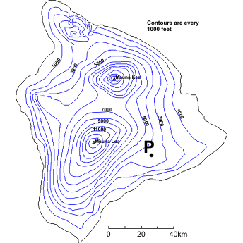
To begin, let's look again at our topographical map of Hawaii (right). How would we go about figuring out the elevation of the point marked "P"? First, we must identify the two contours that lie on either side of "P". In some cases the contours that we need are clearly labeled; however, in other instances you will need to "count" up or down from a labeled contour. In this case we can see that point "P" lies between 3000 ft and 4000 ft contours. Now, here's the key point: The elevation at point "P" can be anything greater than (but not equal to) 3000 ft but less than (but again, not equal to) 4000 ft. We know that point "P" is not equal to either of these values because it does not lie on one of the contour lines.
Technically, this is all that we can say about the elevation at point "P" -- it can be anywhere between 3000 to 4000 feet. However, often instead of giving a range of elevation we would prefer a single number. In such cases, we can interpolate (make an estimate by assuming the elevation changes linearly) between the two known contours. In this case, we can see that point "P" is about half-way between the two contours and thus can be estimated to have an elevation of approximately 3500 ft. Using interpolation usually provides us with a sufficient approximation, but we must always realize that such single values derived from contour plots are only estimates.
What about closed contours? Look again at the contour map and focus your attention on the southern-most peak, Mauna Loa. How might we estimate the height of this peak? Clearly we do not have two contours to use... or do we? The last drawn contour is 13,000 ft. This means that the peak is higher than 13,000 feet. However, we know that the summit of Mauna Loa is not higher than 14,000 feet. Why? Well, if if were, then the 14,000 ft contour would have been drawn around the summit. So, for closed contours, the range is always between the last drawn contour and the next undrawn contour. You should also note that interpolation cannot be performed in such cases because we have no way of knowing how far away the undrawn contour is. In this case, the summit of Mauna Loa is 13,452 ft (within our deduced range of 13,000-14,000 ft).
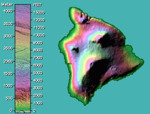
Another way to display the topographical map of the Big Island of Hawaii is to colorize specific bands of elevation. The accompanying elevation key is color-coded for a quick visual tool to determine elevation. By the way, you can access colorful topographical maps of the other 49 states from the web site at Johns Hopkins University.
In similar fashion, we can colorize the interactive isotherm map of the Middle West on which you practiced contouring temperature. Just click the Colorize button on the interactive isotherm map. Consistent with human perceptions, most colorized maps of temperatures use blues and purples to indicate cold air and oranges and reds to highlight warm air.
For a wider perspective of temperature, color-coded national maps give forecasters a bigger picture for pinpointing regions of warmth and chill. Click to access the current national temperature map.
Lest you get the impression that there are no station models over Canada and Mexico, I emphasize that weather reports are indeed routinely taken by observers in our neighboring countries. Indeed, temperature maps provided by the University of Illinois extend their analyses of isotherms to include Canada and Mexico (click on thumbnail labeled "Temperature Contours").
Sometimes, reading values from a contour map can be made easier by adding color. However, one must use care when interpreting which color is which (personally I am looking at the contour values, even if the map is colorized). For example, look at the contour map below. What would you say is an appropriate range in temperature for central Pennsylvania? Given the color is the first shade of green-yellow (or is that yellow-green?), the temperature range is greater than 60 F but less than 65 F. For more practice, check out the group of several closed isotherms over the southwestern U.S. What's a representative temperature inside the smallest closed contour straddling the border between Arizona and Mexico (filled with a relatively deep red)? Answer below...
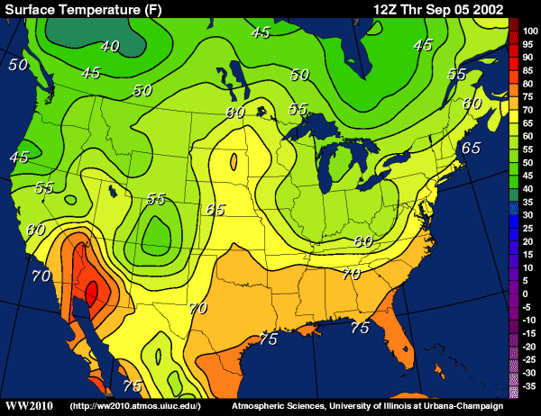
Looking only at the colors, you should note that the small closed contour is three shades of red above pure orange. This means that the temperature is greater than 85 F but less than 90 F. However, you might think that one shade of red looks just like another, so you can approach the problem by simply counting contours. First look at the label for the 60-degree isotherm that begins along the southern California Coast. Note that the contour interval on this map is five degrees, so if you count off from the 60-degree isotherm, you arrive at the indisputable conclusion that the closed contour in question represents the 85-degree isotherm. Thus, temperatures at towns located within the confines of this closed isotherm would range from greater than 85 to less than 90 degrees Fahrenheit.
 Key Skill...
Reading contour maps is one of those skills that you will use over and over in this course. Consider the examples below using various different kinds of contour maps.
Example #1:
Let's start with an easy one. Consider this contour map of temperatures with a point "P" located on the Iowa/Nebraska border. What temperature range would you specify at point "P"?
Answer: Point "P" is located between the 10 F and 5 F contour lines. Therefore, the temperature at point "P" is less than 10 F but greater than 5 F.
Example #2:
Here's another easy one. Consider this contour map of temperatures with a point "P" located in western Virginia. What temperature range would you specify at point "P"?
Answer: Point "P" is located inside the 45 F contour line. Note that the temperature outside of this closed contour is 50 F. This means that temperature is decreasing towards the center of the contour (that is, this is a temperature minimum). Since the contour interval is 5 degrees, the next undrawn contour would be 40 F. Therefore, the temperature at point "P" is less than 45 F but greater than 40 F.Example #3:
Ready for a problem that is a bit more challenging? Consider this contour map of sea-level pressure with a point "P" located in Montana. What range of pressures would you consider possible at point "P"?
Answer: At first, it looks like point "P" is located between 1020mb and ... 1020 mb. If you think of these isobars as elevation (just as a visual aid) You will note that point "P" sits atop a large, flat plateau of pressure. It certainly has a pressure greater than 1020 mb because each of the surrounding 1020 mb lines have lower pressures on the other side. Next, we know that these contours are drawn every 4 mb, so we know that the pressure at point "P" is not greater than 1024 mb (indeed there are some 1024 lines northwest and southeast of out location). So, the answer is that the pressure at point "P" lies between 1020 mb and 1024 mb (not including those values).Example #4:
Following along so far? Good. Here's a problem that will really test your ability. Consider this contour map of upper-level winds with a point "P" located just east of Lake Superior. This contour map comes from the University of Wyoming upper air data site. The colored contours represent wind speed in knots with the first color (light blue) representing winds greater than 70 knots. The contour interval is 20 knots and the colors repeat (light blue, dark blue, white, light blue, etc.) What range of wind speeds would you consider possible at point "P"?
Answer: In this problem, the colored contours can actually work against you. So, when in doubt, we always fall back on contour lines. If I start in the south and move up towards my point, the first white/light blue transition is 70 kts. Then the next transition (light blue/dark blue) is 90 knots. Moving farther north, the dark blue/white transition is 110 knots, and so on. Finally, we see that point "P" lies between the 150-knot and 170-knot (the second nested white) contours. Therefore the wind speed at point "P" is greater than 150 knots but less than 170 knots. Make sense? If you have trouble "counting contours", you might want to print out this map and sketch them in by hand. Quiz Yourself...
Think you understand how to extract information from contour maps? Take this self-quiz below to see how you do. First, hit the "Quiz me" button and look for the red push-pin on the map provided. Fill in the range in values that the pin represents and hit "Submit" to check your answer.